Wednesday, December 29, 2010

Britney Henry Video - Mt SAC Relays 2010


The Britney Henry Project is excited to debut our new video of Olympic Hopeful, Britney Henry competing against the best hammer throwers in the world, at the 2010 Mt. San Antonio College Relays. Read More >>

In addition to my illustration and design work, I organize The Britney Henry Project - a creative collaboration at the intersection of art and athletics. I like to stay busy.   :)
The Britney Henry Project is a group of creative professionals dedicated to creating media assets used to promote Britney Henry, and her effort to earn a spot on the USA Olympic team. The Britney Henry Project team members are all volunteers who donate their time and craft in support of Britney's Olympic dream.

Video by: Andrei Booiakin. Music by: Mark Matcho.

See More >>
 American Woman Video by Andrei Booriakin and Graham Smith. A super rocking, hi def music video featuring Britney Henry throwing the hammer.

Behind the scenes photos by photographer Teresa Heath, she documents the competition and Mt. Sac Relay shoot in the most beautiful and unique way.

Mt. SAC Relays photos and portraits
of the Elite Athletes by Graham Smith, can be seen here.

Read Britney's account of the day on her blog Olympian in Progress.


Mt SAC Relays 2010. Copyright © 2010 The Britney Henry Project. All Rights Reserved.

Thursday, December 9, 2010

Life Drawing Workshop: Ian as Pan


Ian as Pan 18 x 24. Graham Smith

I upgraded to a heavyweight 100lb Strathmore drawing paper for this weeks 2 hour pose at the Wednesday night Life Drawing Workshop. The paper was prepared by drybrushing the Raw Sienna acrylic paint wash over the paper beforehand.

The drawing was done primarily in Burnt Ochre colored pencil, with Scarlet Red pencil and White charcoal details. Erasing the colored pencil without leaving a ghost mark or smearing, is now possible with this paper preparation. yay.

Ian as Pan (Detail) Graham Smith
I do my life drawings all old school. But some of the guys rock laptops with Wacom tablets and do digital life drawing. Here is digital painting of the same pose, by Dzu Nguyen, the organizer of the Life Drawing Workshop.

Afterwards we all went out for noodles.


Thursday, December 2, 2010

Life Drawing Workshop: color washed paper

Meegin: 2 minute warm up - Graham Smith
The other day, I bought two Leonardo Da Vinci books. I spent some time studying his drawings hoping to soak up some greatness. I tried to figure out what he drew with, how big the drawings were, and stuff like that.

I noticed Leonardo Da Vinci prepared his paper with color washes of purples, blues, reds, and rich browns.

Immediately, I went looking for paint to color wash some paper. I wanted to try drawing on the prepared paper at the next Life Drawing Workshop. So, here are some quick drawings of Meegin, doing 2, 5 and 10 minute poses.

Meegin steps up - Graham Smith
Meegin loves books - Graham Smith
Meegin knees up - Graham Smith
Meegin - colored pencil and white charcoal studies - Graham Smith
I diluted Raw Sienna acrylic paint with water and painted a few sheets of 11"x14" Aquabee 93lb Super Deluxe sketchbook paper, and a few sheets of  18"x24" Strathmore 50lb sketch paper. I used a little pump action misting bottle to wet the paper quickly, and a 2" brush to paint the wash over the paper. Make sure and place scrap paper underneath, so you can extend your brushstrokes past the edges of the paper.

I was not sure if color pencil would draw well over an acrylic wash, or if the paper would lose it's tooth. But, I did know the paper would get all wrinkly if I didn't press it flat after it dried. Place the painted sheets inside a big pad of paper and put some books on top to keep them from curling.

The paper kept it's tooth and accepted both color pencil and white charcoal well. But, the white charcoal didn't want to draw over the colored pencil, too slippery.

You can use a hard eraser to lift the color wash from the paper, creating subtle highlights. If you stain your paper with guache or watercolor, this technique works even better.

Meegin - colored pencil and white charcoal studies - detail - Graham Smith

Tuesday, November 9, 2010

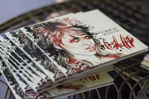
Tori Roze and the Hot Mess


Tori Roze illustration: Graham Smith

I illustrated the portrait of musician Tori Roze for the cover of her new album, from the Hip, created together with her band, The Hot Mess. The album is set to debut, so here is a behind the scenes peek at what it takes to put together artwork for an indy music project like this.

Above, is the finished illustration, and below, is a photo of me autographing a few of the pre-release CD's. (Poolside, of course.)

But I'll tell you, a lot goes into designing a CD package before you get to kick back and sign albums with rock stars. The good thing is, all the work is fun!

Graham Smith - illustrator
A while back: I was drawing Tori Roze at a downtown life drawing workshop. I remember her,  because she stared right at me for the entire 3 hours. At the end of the session, she asks, "Will you draw my album cover? I'm going to release an album one day."

Three years later, the phone rings. "I'm in the recording studio now, finishing my album! Will you still do it? "

Making the B(r)and: To determine a visual direction, we started with a recon mission to watch Tori Roze and the Hot Mess rock the house at a club in Ocean Beach.  Guitarist, music aficionado and champion pumpkin carver, Mike Aryes flew wingman that night. After soaking up the vibe, we scheduled a photo shoot to get some reference shots for me to draw from.

Style: We were lucky to get Photographer Teresa Heath for this shoot at the Bluefoot Bar in Hillcrest, California. Teresa's natural light shooting style was a great match for Tori's keeping-it-real vibe. At the same time, I shot illustration reference shots with my trusty Canon 400d. Hair: Omar Coronado rocked the hair style and makeup, knocking out an inspiring, rock and roll do. Fashion:  Fables by Barrie provided Tori's super-fly, punky outfit.

Tori gets her hair did by Omar Coronado.
Photographer Teresa Heath enjoys a private concert while shooting Tori Roze.
selecting reference shots for a portrait.
Selecting the best reference for an illustration and selecting the best photograph are two different things. Knowing what you want in the final illustration will help you choose.

Illustration: I like to draw the portrait with blue pencil before inking it, working out the composition while developing the likeness. I have the most fun during this part, figuring out all the little geometries, textures and values.

The blue under-drawing was drawn with General's non-repro blue pencil in an Aquabee Super Deluxe 11 x 14 sketchbook. The portrait is inked with Black Cat India Ink on Aquabee paper using a Hunts 513ef nib.


Preliminary artwork - blue pencil on Aquabee paper.

It's all about her eyes....and her hair!

Tori Roze by Graham Smith, ink 11 x 14
Inking is all about drawing. Not tracing. If you only trace the sketch, the line quality may appear stiff and without surprise.

I inked up a few different versions of Tori Roze. This one (above) just didn't have the major dose of attitude needed to be an album cover. I did like the way her lips came out, though.


Graphics: I love hand drawn typography so, I wanted to brush the name of their album all in one go, like the old school calligraphers did. I used a #8 brush and 14 sheets of paper before I got it just right. 


Type: Tori Roze's voice has a delicious old school flavor, and since most of the artwork is loose, I decided to set the bands name in an old typeface with 1930's flavor, as a visual counterpoint.

 The Hot Mess: Serge McCoy - drums, Harley Magsino - bass, Johnny Alexander - guitar, Jordan Morita - trombone, keys, Lee Clark - backing vocals, flute illustrated by Graham Smith.
Design: I assembled the illustrations, logos, liner notes, copyrights and all that stuff into the template provided by the CD duplication house. The final, print ready artwork was provided to the printer as a 300 dpi, cmyk, Photoshop file, uploaded through their website and printed on recycled paper.

album artwork in print ready template
 

Promotion: 2 weeks later, Tori rolled out of bed to sign CD's after returning from her New York City tour. Hell yeah, Rock Star.

Tori Roze holds up her new album "From the Hip".
Tori Roze. photo: Graham Smith


Tori's Roze and the Hot Mess upcoming gigs on: Facebook

Thursday, November 4, 2010

The Reaper


The Reaper. Graphite, ink and digital, by Graham Smith.

See this illustration along with 14 distinguished artists work at the "Of Light and Shadow" art show at DEMA office in Encinitas, California.  818 South Highway 101. Encinitas, Calfornia, until November 17th, 2010.

Archival prints available on request. 100% cotton paper. Matte finish. Hand titled and signed by he artist. $50 each. 13 x 19 inches.


"The Reaper" detail - Graham Smith


Friday, October 22, 2010

Art for Dead People


Making Día de los Muertos decorations is a great do-it-yourself art project. They are fun to make, and since they are made by recycling cardboard, super inexpensive too. These skeleton figures are called calacas and are used as decorations during the Day of the Dead. They are art for dead people.

How to make your own calaca:
    • Draw a skull (or anything) on a piece of cardboard. It doesn't have to be fancy.
    • Cut it out.  I used a snap off blade box cutter on a self healing cutting mat. Make sure and cut away from your fingers. Protect the surface you are cutting on.
    • Draw 2 circles for eyes.
    • and a triangle for the nose.  You know where it goes.
    • Cut them out.
    • Paint it white. I used the least expensive white acrylic paint in the art store. You can use old house paint if you have some. It doesn't have to be perfect. Paint it in quickly, using a dry brush technique. Let the cardboard show through in places - it looks cool like that. I chose to paint the dirtier side of the cardboard, allowing the cleaner side to be towards ones face. It's up to you. I used a 1 inch wide brush.
    • Dry.  If you didn't glop the paint on, it should be dry in 15 minutes.
    • Paint a cool design on it.  I used black India ink and a #3 round brush. Just make sure it's cool looking.
    • Attach the decoration to a stick making a mask to hold in front of your face. Use staples or yarn to tie it on with.
    • Run out to a party and show your friends. The Day of the Dead is a time of celebration, where partying and eating is common.


    Since Día de Los Muertos is a  holiday that focuses on gatherings of family and friends to pray for and remember friends and family members who have died, I like to paint the heart symbol on the forehead of my calaca. Sometimes I paint a glow around the heart, or an eternal flame. That way, the dead know they are loved and will always be remembered.


    Even though Día de Los Muertos is a celebration, sometimes we miss those that have gone. I paint tear drops on my offerings, so the dead know they are missed.


    During the three-day celebration, families usually clean and decorate graves. Most visit the cemeteries where their loved ones are buried and decorate their graves with flowers. These flowers are thought to attract souls of the dead to the offerings.

    In this tradition, I painted the Flor de Muerto around the eyes of my calaca. The ancient Mexican people decorated skulls, and displayed them during the rituals to symbolize death and rebirth.

    In more practical terms, Aztec marigolds, the Flower of Death, contain essential oils used to wash corpses and contain many medicinal properties. They are still commonly planted in cemeteries today.


    In most regions of Mexico, November 1st is Día de los Angelitos, which honors children and infants. On The Day of the Little Angels, toys are brought out to attract their souls. Deceased adults are honored on November 2nd, Día de los Muertos, the Day of the Dead.


    Sometimes, it's our beloved pets we miss the most. I made some rememberances for them, too.


    Día de los Muertos artwork by Graham Smith, made from 100% "recycled" cardboard.

    This is a fun project to do together with your friends or kids. Let the kids draw and paint their decorations, but have an adult cut them out first. Don't let the kids be near box cutters and scissors. Safety. Okay?

    Day of the Dead facts from Wikipedia. Thanks.

    Wednesday, September 29, 2010

    Guns & Girls - short poses


    Franzi with Walther P-99
     Tuesday nights, I sit and draw right alongside the Life Drawing Workshop participants I teach at Sony. These are some of my short pose demonstration drawings. The drawing are 2, 5 or 10 minutes studies, drawn on 18" x 24" Canson 50 pound sketch paper with a 6B graphite stick.

    Franzi with MP-5

    Meegin -Chinese fans I

    Meegin - short poses

    Meegin with Katana

    Meegin - the hitcher

    Meegin - Chinese fan II

    Meegin with P-99

    Meegin short pose

    Meegin short pose

    Meegin with MP-5

    Related Posts with Thumbnails