 |
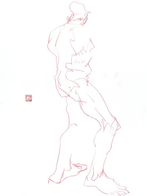
| Color pencil study - Graham Smith |
Drawing from life forces the artist to distill their ideas quickly. There is always a time limit, and the artist must decide quickly what is important, and what they want to say about the figure with their drawing.
I think about placement on the page first - the composition of the drawing. And the most basic concern of composition is getting the figure to fit on the page. You know, without the feet running off the bottom of the page.
Whenever I see drawings, and the feet run off the bottom of the page, I know the artist is drawing from "the top, down", and not drawing "on purpose". The artist must consider the entire page, and the placement of the figure within it, to create a composition deliberately. And not accidently "end up" with whatever you get. "Ending up" with a drawing is not mastery over your craft.
Whenever I see drawings, and the feet run off the bottom of the page, I know the artist is drawing from "the top, down", and not drawing "on purpose". The artist must consider the entire page, and the placement of the figure within it, to create a composition deliberately. And not accidently "end up" with whatever you get. "Ending up" with a drawing is not mastery over your craft.
Now that I think about it, my very first thought, when viewing the models pose, is "tall or wide"... which way shall the paper be oriented, for the best composition?
 |
| Color pencil over acrylic wash - Graham Smith |
Second, after I've decided where I want the figure on the page, I draw a line straight down through the figure's center of gravity, from the top of the head, to the bottom of their feet. This represents the scale of the figure as a whole. As long as the figure is subdivided within that line, the figure will then fit on the page.
Please consider the rule of thirds, or any other composition aesthetic when making the decision where to place this first line. Only fools rush in.
Sometimes this is called the gesture line, and includes information about the flow of the figure, too.
Other drawing methods create an "envelope", an outline that roughly represents the area of the page where the figure as a whole, will reside.
 |
| color pencil over acrylic wash |
Third, I imagine a triangle between the head and the feet, making marks on the paper that represents their relative positions to each other. This insures everything will fit, and immediately indicates how solidly the figure will sit in the space, and how dynamic the pose is.
After those initial calculations, I begin to subdivide the gesture line, into proportions that match the figure, indicating the axis of the waist, shoulders, and knees.
These are my first thoughts, when figuring out how to fit the figure on the page, when drawing from life.
Draw deliberately, with purpose, and place the figure exactly where you want it within your page. Do not just start drawing in the middle of the page, and "see what happens".
What do you think about when first drawing the figure?
 |
| 2 minute warm ups. graphite stick. |
 |
| 2 minute blind contour warm up drawings |
 |
| 2 minute warm up studies, graphite |
 |
| 2 minute blind contour warm up drawing. |
See More: Life Drawings.


