Wednesday, April 27, 2011

A Rat's Life: how to draw a cover for the SF Weekly.


Art Director Andrew Nilsen, of the SF Weekly, called with a dark and gritty assignment to illustrate a story about the ultra-violent, MS-13 gang, by Lauren Smiley. These true, noir stories are just the kind of thing I love to draw. As a kicker, the Art Director asked to film the entire process in my art studio/man cave.

Here is how the whole thing when down, in 10 (hard to follow) steps.


Step 1. Read the article while drinking coffee.
Step 2: Think about it.
Step 3: Draw a bunch of little squares in your sketchbook and fill them in with your ideas.

sketch 1 front view
Step 4: Draw a better version of the thumbnails. In this case, I drew the sketch huge, 18" x 24", because the concept called for lots of detail in the tattoo's, plus the cover is pretty big. Planning ahead, yo.

sketch 2 back view
Step 5: Sketch more. Always give your Art Director some choices. In the back view sketch, the FBI logo is more visible than the shoulder placement on the front view. Both say gang rat. I submitted the two sketches above, plus the sketch book spread.


Step 6: The Art Director notices some good detail in the thumbnails that helps advance the story of the illustration, he asks to see this thumbnail worked up.

sketch 3 gang sign and cuffs
Step 6 : Work up the selected sketch. Less than an hour later, sha-bam, third sketch presented. The AD and I spoke several times to work out little details. I spent the next several hours drawing the MS-13 rat and all his tattoo's.

detail
Step 7: Add something awesome.

Sometime during the development of this drawing, I began to think I needed a tighter tie-in between the gang rat and the FBI. Something that denoted manipulation or control. The FBI logos on his shoulders were nice, but the piece needed more. That's when I added the FBI ear tag - like the kind researchers staple to their test subjects in the wild. That little detail added the extra layer of information that turned this from a drawing into a cover illustration.

If you look closely in the video, you'll see how an old school illustrator uses "cut and paste".

cut and paste the old school way

detail

detail

detail
Each of these tattoos mean something, they are not simply body decoration. MS-13 means "Mara Salvatrucha". "Mara" for gang and "Salvatrucha" for a man from el Salvador. 13 signifies loyalty to the Mexican mafia. 805 is a Mexican area code. A dagger pointing up on the forearm promises revenge. A dagger pointing down means that revenge has been taken. Spider webs means jail time. The higher the placement of the MS-13 tattoo on the body, means the higher ones rank in the gang. If you see gang tattoos placed higher than the shoulder, that means you are dealing with a very serious gangster.

The finished drawing by Graham Smith
Step 8: ink it. (in this case I skipped this part)
Above is the finished drawing. Normally, I would take this drawing, slap it on the light box and begin re-drawing the whole thing in ink to create the final product. This illustration however, called out for a gritty, grimy, raw treatment - so the pencil drawing itself was used directly on the cover.


Step 9: Get the drawing into the computer. Too big to scan, I photographed the drawing using a 50mm lens, f 11, at 1/4 second, with 600 watts of light in RAW format. I even used a tripod and remote shutter release.

Step 10: Experiment, add texture layers, resize and add color in Photoshop.

Work in Progess: MS-13 Rat's Life. Graham Smith
For a while there, I was thinking of making the rat red and the background white. I thought this could work because the rat is making the "devil's horn" gang sign, and the rat would be red, like the devil, and the color of the Salvadoran flag is red and white, but, no.


Always print the illustration at full size to check the color and readability. Here's the print proof next to the original drawing and the finished, uncropped illustration below.

MS -13 "Rat's Life" illustration for SF Weekly: Graham Smith
Art Direction/Cover design: Andrew Nilsen. Illustration: Graham Smith

Here's the old school tools I use to make the illustrations:

Generals 6B graphite stick - fill big areas quickly. Primsacolor Ebony pencil jet black, extra smooth - draw smaller detail with rich black. Dixon Ticonderoga, soft pencil - for drawing detail and building gradients. Mars Steadtler plastic eraser - for wholesale erasing. Tuff Stick eraser - for precision erasing. Kneaded eraser - for lifting graphite in a more delicate manner. Pencil sharpener - get a new one more often than you think. India ink, waterproof - draw and make textured backgounds. Big paint brush - for splattering paint like a wild man. Small round brush - must have rolled away while I was taking a photo!

Tuesday, April 26, 2011

Artists drawing artists


In life drawing workshops across the land, the tradition is: If the model does not show up, the last person to enter the room is the first "volunteer" to pose on stage.

A while back, the artists at the Sony Life Drawing Workshop got their first "volunteer" modeling experience when our model no showed.  Instead, we took turns drawing each other, posing with plastic guns and wooden swords for a few minutes each. Everyone soon had a much better appreciation for the work life models do. Staying perfectly still while looking dynamic, is much harder to do than it looks.


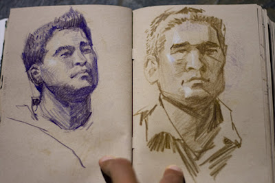
During the second half of the workshop, the artists practiced drawing 10 minute portraits. Taking turns posing seated in a chair was way easier than standing there, holding a plastic gun, dynamically sweating.  Here are a few quick portraits of the Sony artists "volunteering" to pose seated, in a nice chair.


Details for the art geeks: These were drawn in my 8.5 x 11 inch, recycled paper sketchbook (a big 400 pager I stapled and taped together). Used a Lamy Safari fountain pen and a Tombo brush pen to draw the figures. Blick colored pencils to draw the little portraits. The paper is really nice: Neehah Environment, desert storm color, recycled, acid free, smooth.

G.


Tuesday, April 19, 2011

The Cocktail Napkin - Thunder Thighs

The Cocktail Napkin - Graham Smith
Art Director, Craig Edwards pitched an interesting idea for "The Cocktail Napkin" - the last page feature in Miller-McCune magazine. He said, "The feature is a collection of short, humorous stories, I want the illustration to be doodled directly onto a cocktail napkin, then photographed at a bar".

"This months blurb is about a new type of dinosaur recently discovered and the funny name the scientists gave it."

Creating the funny little drawing was the easy part, but the assignment was to deliver a photograph of that drawing.

Suddenly, I needed to recreate a bar scene in my studio, and since this was a rush job, I needed to do it right away. Red reflections were added by dangling Christmas lights just out of frame. I sprinkled water drops nearby to add some authentic bar flair. I did use an actual fountain pen to draw the thunder thighed dinosaur, but not the pen in the photo. That pen is a Pelican, and has a deep blue pearl barrel, chosen as more photogenic than my daily drawer.  Shot = Jack Daniel's.


To get that narrow band of focus on the drawing, I opened the aperture of my 50mm lens up all the way, to f1.8 and popped the camera on a tripod. In the test photos, the shot glass still looked dark, so I held a tiny flashlight above it to add little sparkle details.

Next time, I'll try iced tea in the shot glass. It probably illegal to waste Jack Daniel's for a photo shoot.

Cheers,
G.

Wednesday, April 13, 2011

Art Director Craig Edwards


Craig Edwards by Graham Smith

I illustrated this portrait of Art Director Craig Edwards for an article in St. Louis Magazine about his successful redesign of their magazine.

As an art director, Craig was not happy with how his existing head shots fit the layout, and asked me to draw a more flattering version for the article. I gave his portrait the "rockstar" treatment, punched up his faux hawk and gave him Burt Reynold's eyebrows. To make the portrait a bit more engaging, I changed the direction of his eyes to look directly at the viewer.

# 2 round brush and pen with india ink. EF 513 nib on Aquabee super deluxe paper. 5.5 x 8.5 inches.

Friday, April 8, 2011

Life Drawing Workshop: experiments on washed paper

Ian
Ian struck a slouchy, laid back pose at the life drawing workshop Meetup last night.

Afterwards, we all hit a new noodle shop in Mission Hills, San Diego. Izakaya Masa. We coudn't get to that little hole-in-the-wall fast enough after the workshop, we were all starving! All the artists were delighted to learn they use the old school, wavy style noodles in a super delicious pork broth. Oh yeah. Had to get the deep fried squid and chicken with spicy mayo too.

Sherman
Sherman (the Shermanator) posed for the Life Drawing Workshop I host at Sony. Between helping the artists refine their drawings, I was able to chisel out a drawing of my own. "The Shermanator" got his name from his amazing ability to stand perfectly, absolutely still.

Lizz
Cadi
Lizz is one of the top life drawings models in the San Diego and always a crowd favorite to draw. I'd like to note, her feet are not actually gigantic, I just draw them that way. Also, she has a real left hand, not a catchers mitt as indicated in the drawing. That night, it was all about the spicy squid. The best place to get spicy squid, especially late at night, is China Max. Actually, all the food is great there.

We drew Cadi at the Life Drawing Workshop Meetup, at Art Institute a few Wednesday's back. I laid the drawing out quickly, in the first 20 minutes. When the pose reset for the next 20 minutes, the models chair slid off the stage, scaring everyone in the room. Mostly Cadi. (Not hurt. All cool.) Later that night, we all went out for Japanese noodles at Tajima.

I learned it's better to start your drawing over, than try to fix a slightly moved pose. Annnd, don't put the models chair near the edge of the stage. It's considered "very bad luck" if you damage the models!


Terracotta, scarlet red, burnt umber, indian red, delta blue and white charcoal pencils on 18 x 24 inch, 80 pound Strathmore Premium Recycled drawing paper, with a raw sienna acrylic wash.


Monday, April 4, 2011

Howard Schultz - CEO of Starbucks

Howard Schultz CEO of Starbucks:  Graham Smith

Art Director Dean Sebring of Worth Magazine, showed me a really great looking layout for their Twenty Questions feature, and asked if I would illustrate an ink portrait of Howard Schultz, CEO of Starbucks, for this months issue. Worth magazine is beautifully designed and chock full of great illustrations. I jumped on the chance to illustrate that page.

These ink portraits are drawn quickly, straight off the pen. I usually draw a few portraits and choose the nicest one. Maybe I should have drawn Howard Schultz using coffee, instead of ink for this one?

Worth Magazine with original ink illustrations in the background.

Contributors blurb by Lynsey Santimays.
Lynsey Santimays, associate editor, called me up to do a quick blurb interview for their contributors section. We were just chatting away, but after 16 questions, I ask how many words the blurb was supposed to be. "150. I like to get as much as a can. You never know." she responded.
 
"I draw a bunch and choose the nicest one." Graham Smith
I illustrate these with a quill pen, the kind you dip in ink. The thing is, the portraits come out a little differently each time. If I spill ink, drip on the page, or the final result doesn't look this the subject,  I have to start over. There is no erasing in ink drawing! I love the challenge drawing with this unforgiving medium.

Art Direction:Dean Sebring.  Portrait: Graham Smith

See More >> Worth #2: Aby Rosen
Related Posts with Thumbnails